


PIDGraph: Redesigning AI-Powered Industrial Tool
A research-led UX improvement that took a platform engineers struggled to use (SUS 30.4 — "unacceptable") and transformed it into one they recommend (SUS 80.3 — "excellent") through rigorous audit, remote contextual inquiry, and 40+ targeted design changes.
Key outcomes
80.3
Final SUS score — up from 30.4
0.2%
Error rate — down from 13%
40+
Design recommendations shipped
10+
New features introduced
Role
UX Designer & Researcher
Timeline
Dec 2020 – Apr 2021
Method
UX Audit & Contextual Inquiry
Participants
5 Engineers (Germany & Ukraine)
01 — Context
The problem: engineers were fighting the tool instead of using it
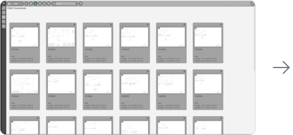
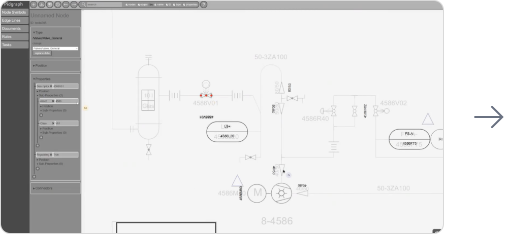
PIDGraph is an AI-powered platform used by industrial engineers to digitize paper-based Piping and Instrumentation Diagrams (P&IDs). The AI converts hand-drawn technical drawings into accurate digital versions — but when the AI output was incomplete or incorrect, engineers had no efficient way to fix it manually.
The result: a platform with enormous potential that was actively frustrating its core users. My brief was to understand exactly where it was failing and design a solution that gave engineers back control.
What PIDGraph does
Engineers upload scanned P&ID drawings. The AI automatically identifies and classifies piping symbols, instruments, and connections — converting them into a structured digital format.
Where it was failing
When the AI made errors — which it did — the manual correction workflow was slow, confusing, and error-prone. Engineers were losing trust in the output and spending excessive time on fixes.
02 — UX Audit
Starting with evidence: a structured heuristic evaluation
Before speaking to any users, I conducted a thorough heuristic evaluation against Nielsen's 10 usability principles, benchmarked against three competitor tools that solve similar problems. This served three purposes: build my own platform fluency, create stakeholder-ready evidence for why user research was necessary, and design a focused testing protocol around the real pain points — not assumptions.
Heuristic #1 — Visibility of status
No clear feedback when AI processing was running, complete, or had failed. Engineers couldn't tell if the system was working.
Heuristic #3 — User control
No undo/redo for manual edits. A single mistake required restarting the correction workflow from scratch.
Heuristic #6 — Recognition not recall
P&ID symbol library required engineers to remember classification codes rather than recognizing visual symbols.
Heuristic #4 — Consistency
Editing tools used different interaction models in different parts of the platform with no consistent pattern.
Heuristic #8 — Minimalist design
The interface surfaced all configuration options simultaneously, overwhelming engineers during routine tasks.
Heuristic #5 — Error prevention
No confirmation dialogs on destructive actions. Engineers could accidentally overwrite AI output with no warning.
High Severity
Medium Severity
Low Severity
Why the audit came before user testing
Presenting heuristic findings to stakeholders gave me a concrete, evidence-based case for investing in user research — before spending any budget on participant recruitment. It's a sequencing decision that builds organizational trust in the research process.
03 — User Test
Remote contextual inquiry: watching real engineers in their real environments
I chose remote contextual inquiry deliberately over lab-based usability testing. P&ID work is deeply context-dependent — engineers work with large second monitors, reference physical drawings alongside the digital tool, and are interrupted by colleagues. A decontextualized lab session would have missed half the story.
Method
Remote contextual inquiry
Participants
5 frequent users
Session duration
1–2 hours per participant
Locations
Germany & Ukraine
Quantitative findings from the baseline session confirmed what the heuristic audit suggested — and then some:
Before — Baseline
SUS score
30.4
Error rate
13%
Total errors observed
18
Severity
Medium
After — Post Redesign
SUS score
80.3
Error rate
0.2%
Total errors observed
1
Severity
Low
What do these SUS scores mean?
Baseline
Post-redesign
0
25
51
71
100

Good (71)

Marginal (51)

30.4 — Baseline (unacceptable range)
80.3 — Post-redesign (excellent range)
Qualitative analysis via affinity mapping surfaced three dominant themes across all five participants:
Loss of trust in AI output
Engineers had learned to distrust the AI's classifications and were manually reviewing every element — even correct ones. The tool had no way to communicate its own confidence level.
Correction friction
Finding and fixing a single AI error required navigating 4–6 steps across disconnected parts of the UI. Engineers described the correction workflow as "hunting."
No recovery path
The absence of undo meant engineers were afraid to make edits. Several described working in a "read-only mindset" to avoid making irreversible mistakes.
04 — Recommendations
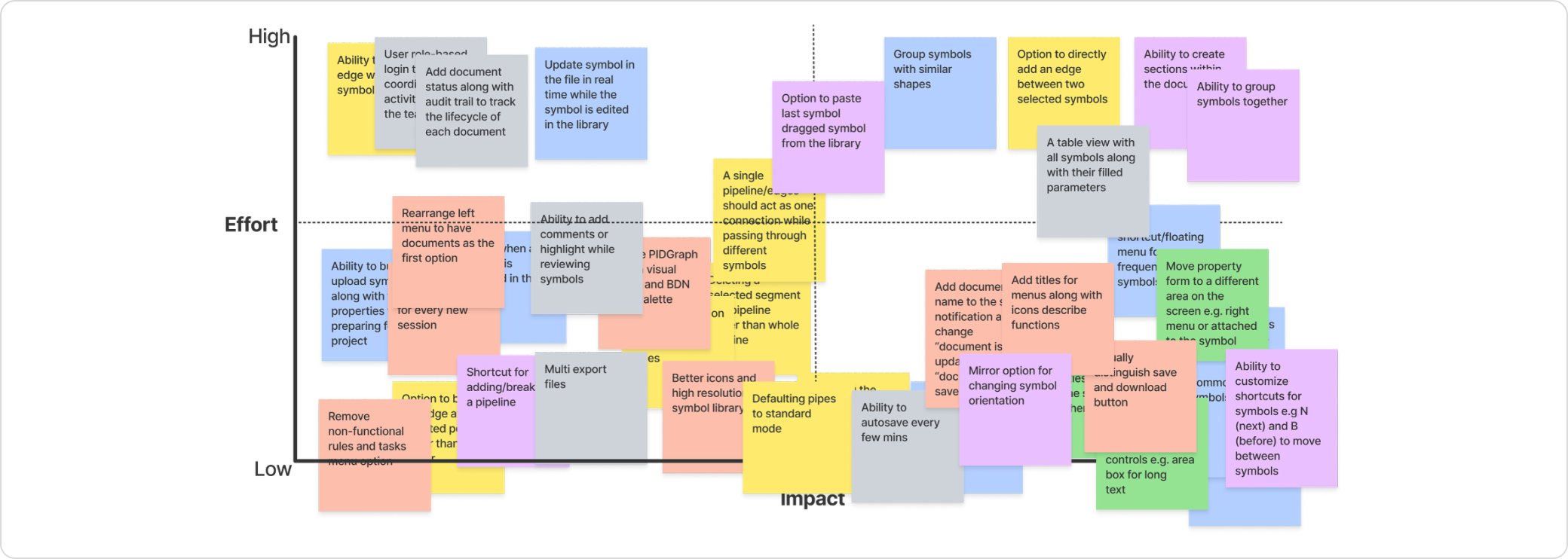
40+ recommendations prioritized by impact and feasibility
Not every finding becomes a recommendation, and not every recommendation ships. After the research synthesis, I developed 40+ specific changes organized into three categories — then worked with product and engineering to assess feasibility and prioritize by user impact vs. implementation cost.
18
Interaction & workflow
Undo/redo system, streamlined correction flow, confidence indicators on AI output.
14
Information Architecture
Tool panel reorganization, progressive disclosure of advanced options, consistent navigation model.
10+
New Features
Visual symbol library, bulk edit mode, error summary dashboard, session history.
How prioritization worked
I ran a prioritization workshop with the product and engineering leads using an impact/effort matrix. Undo/redo and the AI confidence indicator were the two highest-impact, lowest-effort items — they went into the first sprint. Feature additions were phased across subsequent releases based on engineering capacity.
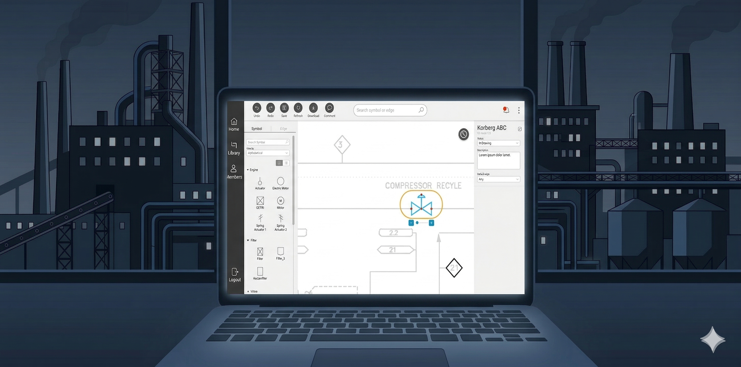
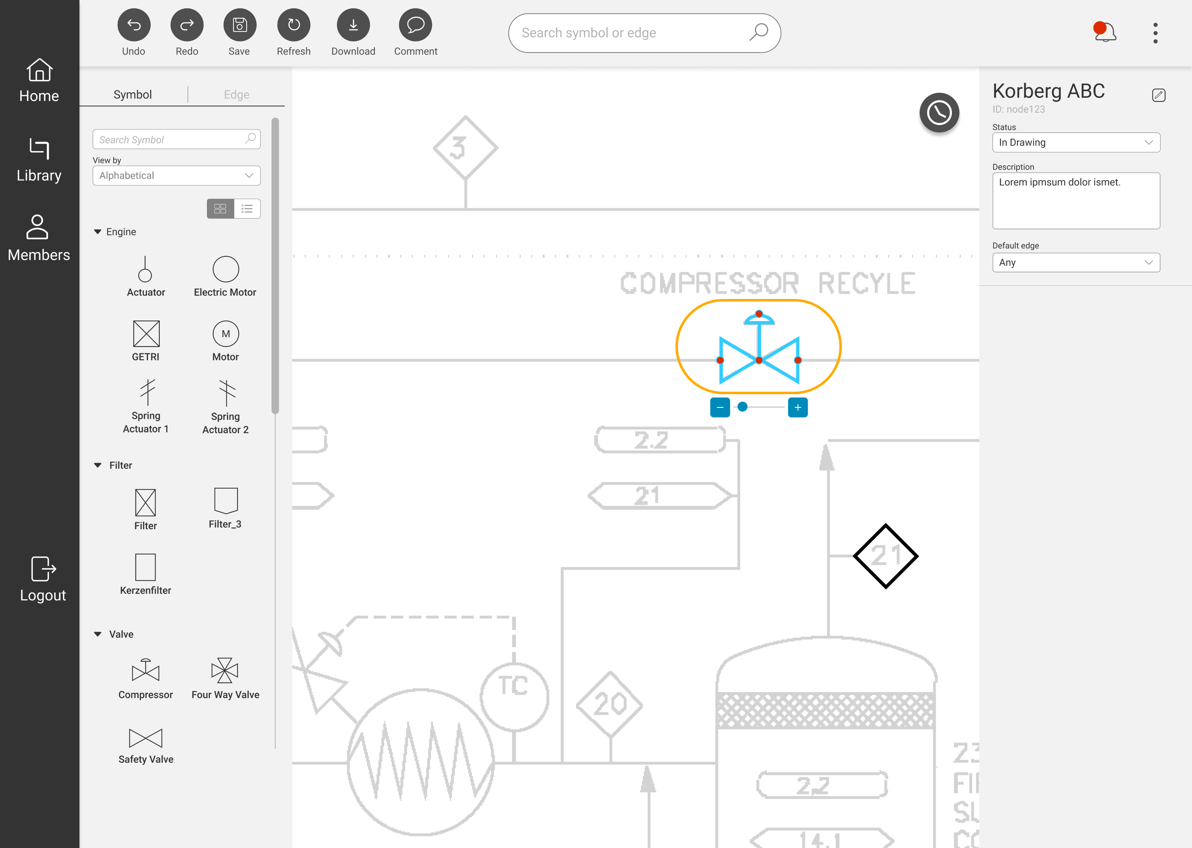
05 — New Design
Redesigned within the existing design system
The redesign maintained alignment with Bilfinger's brand identity and existing component library — the goal was not to rebuild the visual design, but to fix the interaction architecture and add the missing control mechanisms engineers needed. Consistency with what already existed was intentional: engineers shouldn't need to relearn a familiar product.
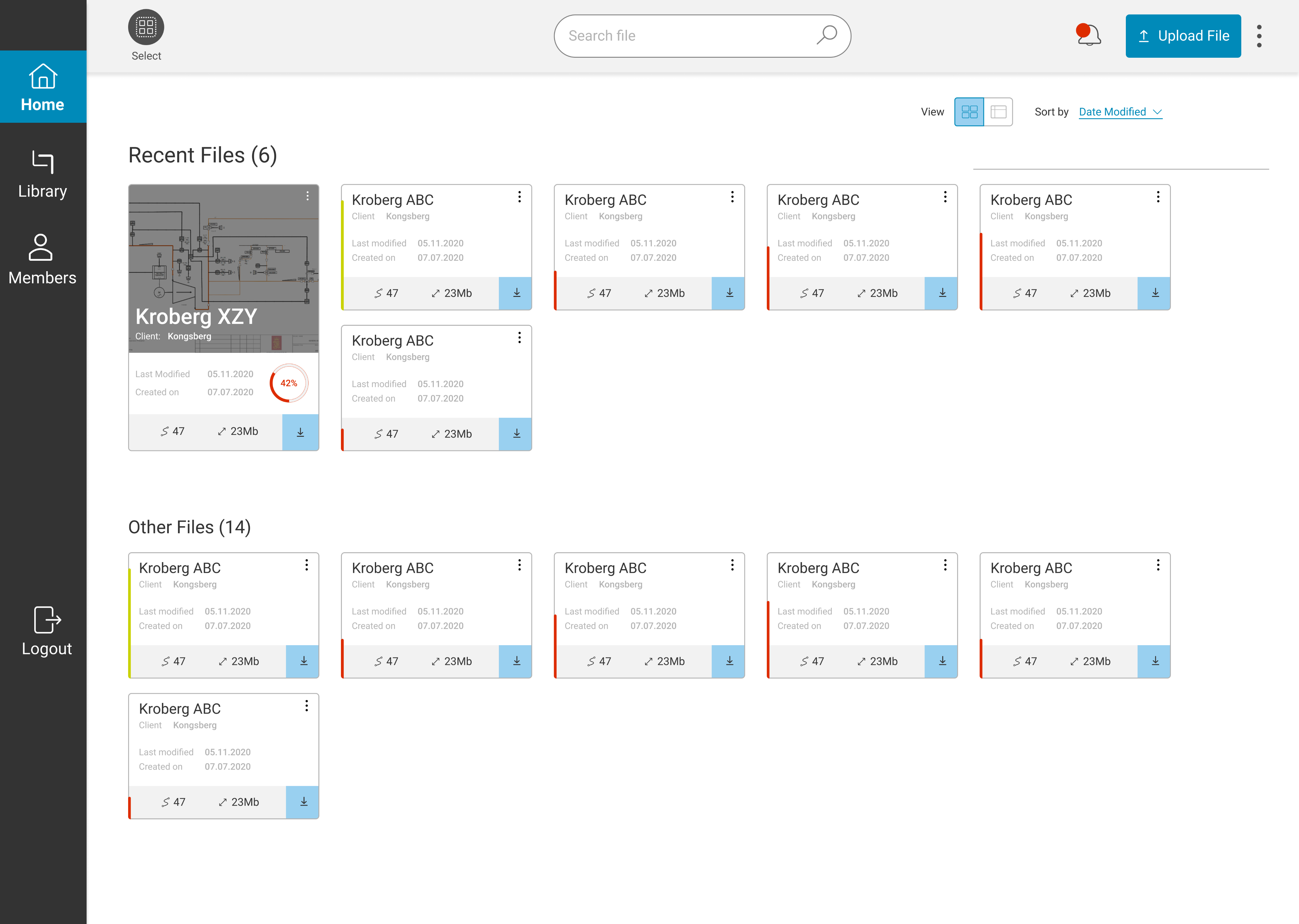
Redesigned interface — before and after
06 — Validation
A second round of testing with the same participants and same tasks
The validation study used identical tasks, identical metrics, and wherever possible, the same five participants from the baseline round. Methodological consistency was deliberate: it's the only way to make before/after comparisons credible.
Method
Usability Testing
Participants
5 (same cohort as baseline)
Session duration
1 hour per participant
Task
Identical to baseline session
The results confirmed the redesign had worked — not just marginally, but categorically. Moving from a SUS of 30 to 80 means crossing from the "unacceptable" band into the "excellent" band. The error rate drop from 13% to 0.2% (18 errors to 1) represents near-elimination of the failure modes identified in the audit.
SUS improvement
+163%
30.4 → 80.3
Error rate reduction
−98%
13% → 0.2%
07 — Takeaways
What this project taught me
01
Sequence research to build organizational trust, not just to gather data
Starting with the audit — before asking for user research budget — gave me credible evidence to justify the investment. This sequencing is a stakeholder management decision as much as a research one.
02
Context matters more than quantity in expert user research
Five engineers in their real working environments told a richer story than a larger lab sample would have. Remote contextual inquiry was the right method for this user group, not the convenient one.
03
The biggest UX fix is sometimes the most obvious missing feature
Undo/redo is table stakes in any editing tool. Its absence had created a cascading anxiety that affected every other interaction. Sometimes the right insight from research is embarrassingly simple — and that's exactly why you do the research.
← Previous case study
In-car infotainment system
CARIAD / Volkswagen Group
Next case study →
UXIM: A Prioritization Methodology
Bilfinger Group
© 2025 Michael Gibran